
One of the many improvements introduced in the version 12.1 of Safari is the support for the Intersection Observer. Thanks to this enhancement, all modern browsers are now supporting this API and it is therefore possible to detect when a particular element would become visible with the exact same piece code (almost) everywhere.
As Web Components could be use in any frameworks or even without, respectively could be use everywhere too, I thought it would be cool to display how to create such a component in order to lazy load images with the help of the Intersection Observer API.
When it comes to Web Components, I have a bit more experience with the StencilJS compiler as I’m currently using it to develop our upcoming o en source editor for PWA presentations, DeckDeckGo. That’s why I will use it for the purpose of this tutorial. If you never used Stencil yet, no worries, this tutorial is a step by step, you don’t need to know it to go thru the post and I even hope you will like to discover it. I personally think it’s a lot of fun to play with StencilJS
Getting started
To begin our (short) journey, we are going to create a new Web Component using StencilJS. For that purpose, run npm init stencil in a terminal and follow the prompt:
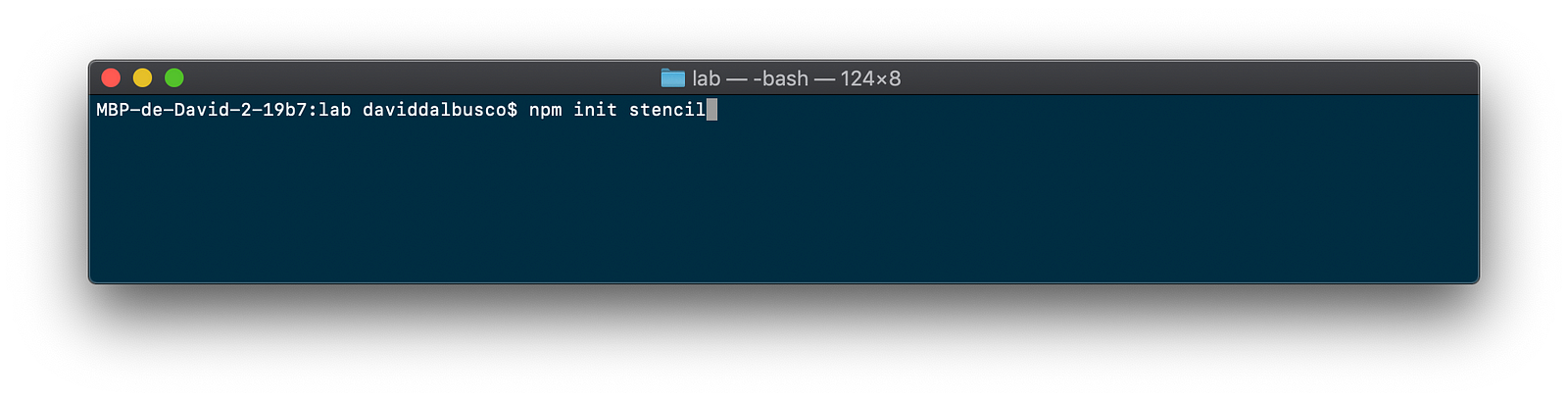
Run the initial command
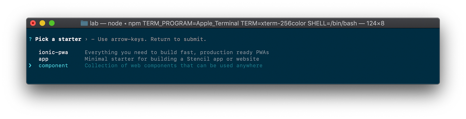
Select “component” as we want to develop a library
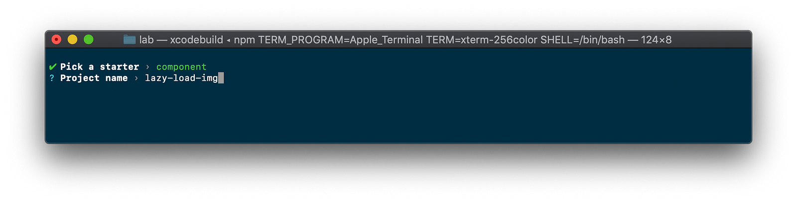
Give a name to the component and project, like “lazy-load-img”
Note: To shorten the tutorial I won’t cover here how you could rename the default namespace and component’s names, just ping me if you would have specific questions about it.
Coding
Let’s code (yes, already, starting a project with the Stencil CLI is a pretty fast process 😂). Open the file src/components/my-component.tsx in your favorite editor and remove the default code generated by the CLI. Once done, the file should looks like the following:
import { Component } from '@stencil/core';

@Component({
  tag: 'my-component',
  styleUrl: 'my-component.css',
  shadow: true
})
export class MyComponent {
}
Rendering an image tag
Now that our component is empty we could begin adding the first relevant piece of code, a property for the URL of the image, in order to be able to specify it using an attribute when we will use the component, and a render method which, well, will render the image when the component will be used:
import {Component, Prop} from '@stencil/core';

@Component({
  tag: 'my-component',
  styleUrl: 'my-component.css',
  shadow: true
})
export class MyComponent {

  @Prop() imgSrc: string;

  render() {
    return <img data-src={this.imgSrc}/>;
  }
}
As you could notice we **didn’t **specified the correct image’s attribute src but rather used a pseudo-attribute data-src . Doing so, we are avoiding the automatic loading of the image, as the browser won’t find a source to load. We will later on take care of loading it correctly respectively we will defer the loading of the image, we will take care to lazy load the image.
Intersection Observer
At this point, our component is able to render an image (tag at least), we should now bind an Intersection Observer on this tag in order to detect when the image will be visible in the viewport (think for example about a huge scrollable page, we want to detect when an image, which is positioned at the far bottom of the page, will after a bit of scrolling become part of the viewable viewport/window/browser).
To bind our observer, we gonna use the event componentDidLoad which, well, is triggered when the component is loaded. In that particular function we will then search for our image and bind the Intersection Observer.
Note: our component is shadowed, that’s why we are querying the element on its shadow root respectively this.el.shadowRoot.querySelector and not this.el.querySelector as it would be the case if the the component would not be shadowed.
@Element() el: HTMLElement;

private observer: IntersectionObserver;

componentDidLoad() {
  const img: HTMLImageElement =
                 this.el.shadowRoot.querySelector('img');

  if (img) {
    this.observer = new IntersectionObserver(this.onIntersection);
    this.observer.observe(img);
  }
}
In this particular example I didn’t provided any options to the Intersection Observer beside the function this.onIntersection which we are about to declare. If you wish to know a bit more about these, there is a nice and easy post entry on the Webkit blog about it.
Loading
We could now write the final piece of our code, the function which is triggered when an element will become visible in the viewport respectively onIntersection . This method will do nothing more than receiving the element which is now ready to be intercepted, check if we already triggered manually the display of the element (by just checking if the data-src attribute is still there) and if not, will display the image (by converting the data-src attribute into the proper image source attribute src ).
private onIntersection = async (entries) => {
  for (const entry of entries) {
    if (entry.isIntersecting) {
      if (this.observer) {
         this.observer.disconnect();
      }
      if (entry.target.getAttribute('data-src')) {
        entry.target.setAttribute('src',
                        entry.target.getAttribute('data-src'));
        entry.target.removeAttribute('data-src');
      }
    }
  }
};
All together
Summarized, the all code of our component contains:
- A
rendermethod to well, render our image but first withoutsrcto “block” the automatic loading of the image - A
componentDidLoadmethod where we hook on the component state to initialize the Intersection Observer for our image - A custom function
onIntersectionto detect when the component, respectively, the image would become visible in the viewport and to effectively trigger/start displaying it
All together our component’s code should look like the following:
import {Component, Prop, Element} from '@stencil/core';

@Component({
  tag: 'my-component',
  styleUrl: 'my-component.css',
  shadow: true
})
export class MyComponent {

  @Element() el: HTMLElement;

  @Prop() imgSrc: string;

  private observer: IntersectionObserver;

  componentDidLoad() {
    const img: HTMLImageElement =
               this.el.shadowRoot.querySelector('img');

    if (img) {
      this.observer = new IntersectionObserver(this.onIntersection);
      this.observer.observe(img);
    }
  }

  private onIntersection = async (entries) => {
    for (const entry of entries) {
      if (entry.isIntersecting) {
         if (this.observer) {
             this.observer.disconnect();
         }

         if (entry.target.getAttribute('data-src')) {
             entry.target.setAttribute('src',
                        entry.target.getAttribute('data-src'));
             entry.target.removeAttribute('data-src');
         }
      }
    }
  };

  render() {
    return <img data-src={this.imgSrc}/>;
  }
}
Testing
StencilJS comes with a handy [development server](https://stenciljs.com/docs/dev server/) which we are going to use to test our component. Before starting it, we are going to edit the file src/index.html in order to consume our component multiple times as we want to simulate a long scrollable page. You could for example edit this Html page and add multiple times the same image. Furthermore, we are are going to define a bit of styling on our component to let the browser understand which images are in the viewport and which aren’t.
<!DOCTYPE html>
<html dir="ltr" lang="en">
<head>
  <meta charset="utf-8">
  <meta name="viewport" content="width=device-width, initial-scale=1.0, minimum-scale=1.0, maximum-scale=5.0">
  <title>Stencil Component Starter</title>
  <script src="/build/mycomponent.js"></script>
  <style>
    my-component {
      display: block;
      height: 1000px;
      width: 100%;
    }
  </style>
</head>
<body>

  <my-component img-src="https://deckdeckgo.com/assets/img/deckdeckgo.png">
  </my-component>
  <my-component img-src="https://deckdeckgo.com/assets/img/deckdeckgo.png">
  </my-component>
  <my-component img-src="https://deckdeckgo.com/assets/img/deckdeckgo.png">
  </my-component>
  <!-- Etc. add multiple times the component -->
</body>
</html>
Once edited, we could now start the development server with the command npm run start

Start the development server
And once executed, open Chrome or Safari at the address http://localhost:3333 and test your lazy loading component 🎉

As you could notice in this animated gif above, I added a console output to display in the debugger when images are effectively loaded. At first, only one image is loaded but when I began to scroll, the other images began to be loaded as soon as they appear in the viewport (see the counter in the debugger)
What’s next
Our component is pretty neat but you may want to improve it with some Intersection Observer options and also with some more properties or CSS4 variables for the shadowed image of the component, like the alt , width and height attributes.
If you have specific questions regarding that particular subject or maybe even want me to write a follow-up blog post to describe these steps, let me now!
Cherry on the cake 🍒🎂
Like I said in my introduction, I did implement such a component for our upcoming open source editor for PWA presentations called DeckDeckGo. Therefore you could find my implementation on GitHub.
Our editor is now yet live online, but if you wish to give us a hand to test it, you are most welcomed to join our beta program. Finally, if you have any ideas of improvements, don’t hesitate to ping me, that would be super neat 🤙
To infinity and beyond 🚀
David